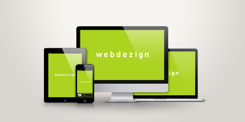
We are utilising responsive design!
It’s our pleasure to announce, that recently we have upgraded our own website to a responsive design. As a web design agency we are responsible for creating websites that are available to view for everyone whether they are using a mobile, laptop or any other device and to achieve that – flexibility is the key!

Responsive design, what is that?
Instead of creating a new website version for every different device that exists, we can work on making the information itself to be flexible and not the outside form of the website. That is where responsive architecture comes in; it’s introducing a set of techniques and ideas that make website adjust itself to fit the browser comfortably, even if you make the page as skinny as the resolution of a mobile phone.
The best way would be to try it yourselves! If you are using a laptop or a PC, we are inviting you to click on the corner of your browser window and drag it through the monitor. You can see that the website’s content is now intelligent on its own and it will resize the images, change the resolution and adjust itself to the size that you choose. If you are using your iPhone, then flip it vertically (or horizontally) and you can see that all the content is loaded logically and it fits your device perfectly, you don’t have to scroll horizontally any more! From now on, weather you are using a PC, laptop, iPhone, iPad, Kindle or any other device, you will always get the same results!
So you are probably asking yourself why the sudden change? Before we used to create a new website version for every different device separately but because the number of new devices grows so fast and different screen sizes come with it, it’s getting near to impossible to follow all the changes. The responsive design is a very different way of creating websites and it represents the future!
Write to us
or call the number 020 8446 1515

